Your business is worth investing in, and it’s not just about having a website. You can’t just make an ad for your business and expect people to find you. You must build relationships with potential customers before they know what you do! A successful digital marketing strategy should be designed around three core tactics:
Creating a home page that tells visitors what you do in three seconds or less.
A home page is your business’s first impression; thus, you must make a good one. If you can’t tell visitors what you do in three seconds or less, they’ll leave before they even get started. Here are some ways to create an effective home page:
- Use a headline that tells visitors exactly what you do on the site (and why they should come back).
- Include a photo that helps tell the story of what happens at your company every day—and why people might want to hire you for their next project.
- Add call-to-action buttons at the bottom of each section so visitors know exactly how many services or products are available from which companies/people.
Designing with a single, easy-to-follow visual hierarchy.
- Use a grid to organize your content.
- Use color to emphasize important elements.
- Use the right font size for each element and its function (e.g., headings should be larger than subheadings).
- Make sure you’ve used visual cues to show hierarchy in all of your designs, and make sure that this is consistent across platforms and between devices (iPad/iPhone vs PC/Mac).
Using white space to your advantage.
White space can help your business grow. It’s known as negative space, and it’s an important part of any website layout.
White space isn’t just for looks; it plays an important role in how visitors read and perceive your content. For example, if you have lots of text on a page but few images or other visual elements around it (like bolded headings), then the reader may struggle to understand what you’re saying because there are no cues from other parts the page to help them out. This makes things harder for them when they want information from you!
Using white space effectively will also ensure that everything on your site has room around it, so users feel comfortable clicking through without too much clutter cluttering their screens.
Keeping your design simple and minimal.
Keep it simple to ensure that your website is easy to navigate and user-friendly. Keep it clean. Use simple colours, fonts and shapes so your customers can easily find what they want on the screen.
Also, ensure that your website’s background is not too busy or cluttered with unnecessary imagery or images (this can be distracting).
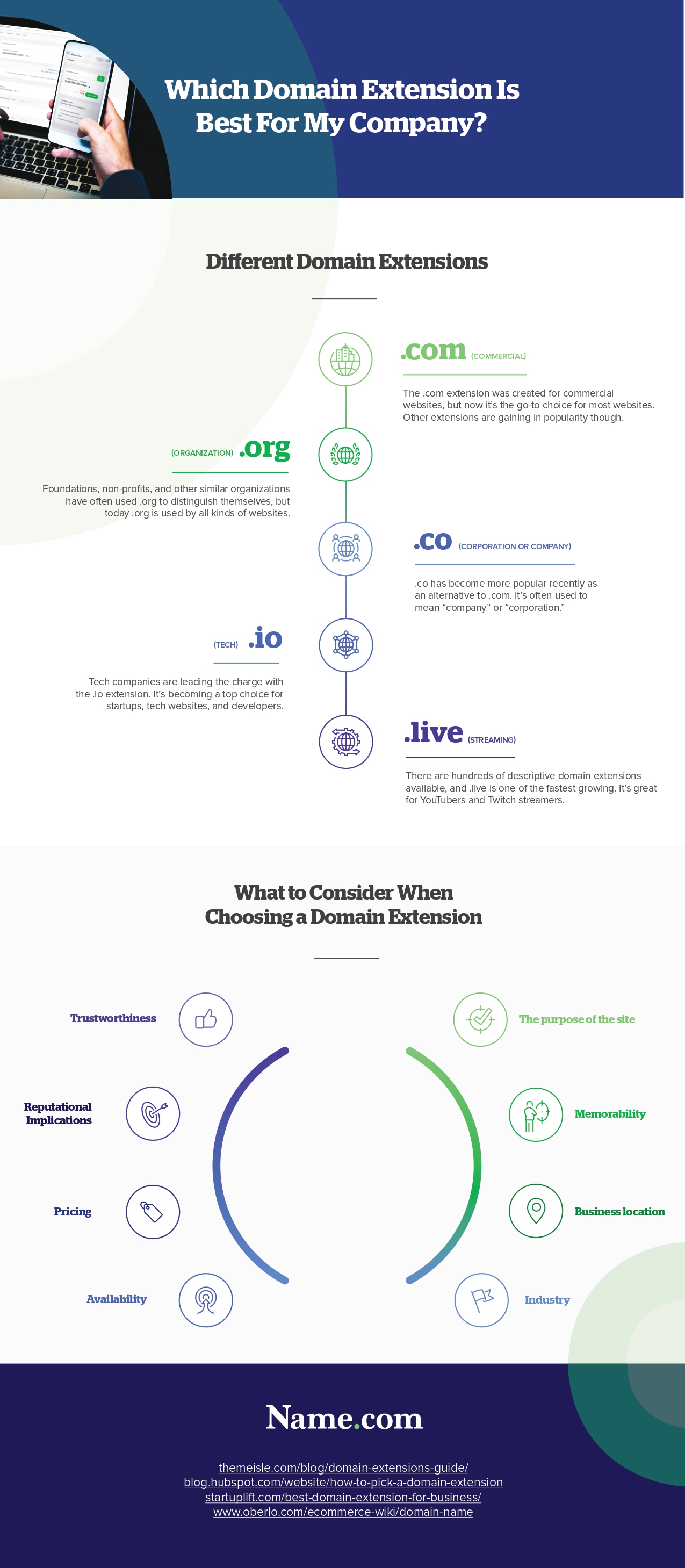
Infographic Created By Name.com, High-Quality Website Builder
Making your call-to-action buttons big and noticeable.
A call-to-action button is the most important element on your website because it’s what people click on to learn more about what you offer. It’s also the best way to get them moving toward your business goals.
Bigger is better when it comes to call-to-action buttons; they should be large enough so that they’re easy to see and read from across the screen.
If you’re using an image as part of your button, make sure there are enough contrast between the background color and text color so people can still see what you’re asking them for—and remember that background colors should be darker than foreground ones!
When designing a website or revamping an existing one, it helps if all three elements (the page title bar at top left corner; header image at top center; main content area) relate somehow: maybe by sharing similar colors or shapes?
Focusing on mobile experiences.
Mobile is the future, and it’s here to stay. With mobile traffic growing, your website must have a mobile-friendly design. A responsive design means your website will look good on any device, including smaller phones like smartphones, tablets and even laptops!
Responsive web design (RWD) is an approach to web development that considers how people use different devices, such as desktop computers or handheld devices, such as smartphones and tablets. It helps developers create websites that work well across all these platforms while also ensuring they load quickly enough, so users don’t have to wait too long before seeing content on their screens.”
The above tactics can only apply when working with a website design Crawley professional. They better understand the language and know what works best for your site.


Leave a Reply
You must be logged in to post a comment.